


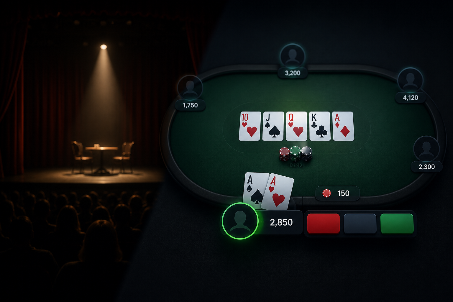
Anyone who has sat in a small theatre knows the moment the lights do their work. The house dims, one instrument warms the downstage corner, and two hundred eyes travel to exactly the spot the designer chose for them a month earlier. Attention, it turns out, is choreographed. The designer’s paradox is that the audience must never feel directed, only drawn; coercion reads as clumsy, gravity reads as craft. A recent production made the point by subtraction: Poe: Pulse and Pendulum played much of its running time in darkness, and the less the audience could see, the more precisely the production controlled what they felt.
Game interfaces are stage design with a participant instead of an audience. A digital card table is an interactive canvas that must direct a player’s focus, pace their emotional rhythm, and then get out of the way of a decision that may carry real weight. Designers talk about cognitive load, the total mental effort a screen demands, and the concept could have been invented for card tables. Clutter, noise and competing colors all tax the same limited attention a player needs for the actual choice in front of them, and research firm Nielsen Norman Group has spent years documenting how overloaded interfaces degrade human performance. At a poker table, degraded performance has a price in currency.
Color, contrast and the hierarchy of a hand
Look closely at a well-made digital table and you’ll find the same decisions a lighting designer makes:
- A muted ground. Deep felt greens, charcoals and navy dominate because they hold the eye at rest. The background’s job, on a stage or a screen, is to recede gracefully for hours without fatiguing anyone.
- Focal accents. Against that quiet field, a handful of saturated elements carry the information that matters right now: the pot, the action buttons, the glowing ring that says it’s your turn. High contrast is spent like stage light, only on the protagonists.
- Typography under pressure. Bet amounts and stack sizes are read in seconds, mid-decision, often on a phone. Clean numerals, generous sizing and disciplined alignment aren’t aesthetic luxuries; they’re the difference between reading the situation and misreading it. Physical casinos learned the equivalent lesson decades ago, which is why chip colors follow long-standing high-contrast conventions: legibility under stress is a solved problem when someone bothers to solve it.
- Spatial balance. Cards, community board and players arrange into a stable visual geometry so that repeated glances land in the same places. Rhythm lowers effort; effort saved goes to the decision.
The choices don’t announce themselves, which is precisely the craft. As with a good set, you notice the failure, never the success.
From velvet ropes to vector lines
The history of poker interfaces recapitulates a century of design argument in about twenty years. Early clients were exercises in skeuomorphism: wood-grain rails, rendered chandeliers, chips with drop shadows deep enough to swim in. There was a logic to the ornament once. Early online rooms were selling legitimacy, and imitation mahogany was a trust signal for players who missed physical card rooms. Only later did the industry notice that the imitation was spending attention the game itself needed; the intent was theatre in the Vegas sense, and the cost was noise, every ornament competing with the numbers.
The reform movement, as in graphic design broadly, was flat, vectorized and ruthless about clutter. On a phone, the WPT Global poker platform makes the new orthodoxy legible at a glance: the table runs vertical and is composed for one hand, the palette hoards its brightness for live information, and the numerals hold up at arm’s length. It’s the minimalist stagecraft position applied to cards, the belief that the drama belongs to the hand being played, not the furniture around it. Whether any given player wins more on a cleaner client is unknowable; that they’re deciding with less visual static is simply how attention works.
There’s a fair counter-argument, and honest designers make it: strip too much and you lose warmth. A card room with no texture at all can feel like a spreadsheet, and some of the pleasure of poker is atmosphere. The best current interfaces thread this needle the way a good production designs a minimalist set that still has a soul, with texture in the details and restraint in the information plane.
The canvas keeps evolving
What comes next looks like more personalization of that canvas: themes, table textures and card styles chosen by the player, layered over an information hierarchy that stays fixed and disciplined underneath. The ornament becomes optional; the clarity doesn’t. That split, a fixed skeleton wearing an expressive skin, is roughly where theatre landed too. The proscenium doesn’t move; the production inside it does.
For an arts audience, the exportable lesson has nothing to do with cards. Every interface we touch is directing our attention with a stage designer’s tools, and most of us never notice the choreography. Poker just happens to be a venue where the cost of bad design shows up as a number. Watch where your own eye goes the next time any app wants something from you; the blocking is all there once you look for it.